Choosing Type
A story-first guide to choosing type that fits
There are too many ways to choose type for a project, honestly. Some of them are technical, some are historical, and some amount to a designer staring at two perfectly good options until one feels slightly less wrong. Sometimes a free typeface is exactly right. Sometimes the right one is worth paying for. Either way, I think there are better ways to choose than just calling one “clean” and moving on.
Where this usually shows up #
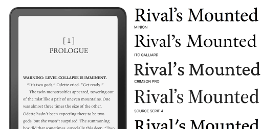
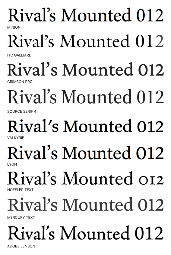
Look at these type specimens below. I used them to choose my e-reader font. I did look closely at curves and serifs, but that was not the deciding factor. I chose Valkyrie partly to support Butterick's Practical Typography, which I have referenced for years. A good resource like this really helps inform your taste. You pick up knowledge along the way and that helps give you confidence in your choices.
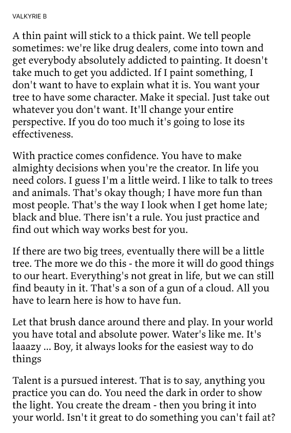
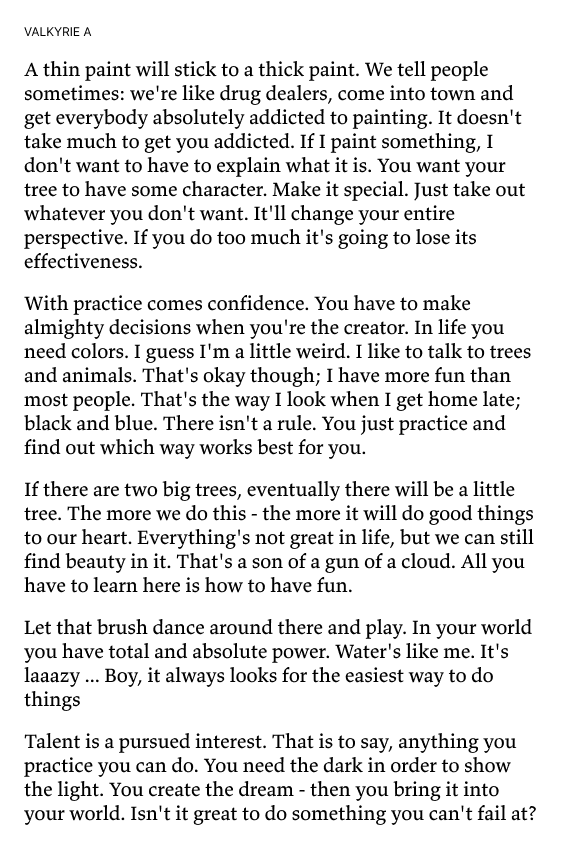
One thing we can learn about is how different cuts, A and B, are made to support printing on different qualities of paper. Maybe that can help us decide which cut is better for an e-ink display. I really like Valkyrie because it includes a lot of special features like that.
My e-reader choice is one small example. The same story-first reasoning shows up in places like these:
- Personal or professional website or email newsletter
- Coding, writing, or generally working
- Business papers
- Cover letter or a resume
- Marketing materials like a post card or a poster
Most of these are “small” decisions that quietly become daily decisions. If you are staring at text for hours, the type is part of your mood, your pace, and your confidence. That is why this matters even when nobody else can name the font.
Choosing type that disappears #
A good typeface disappears. If you are designing a website for an HVAC repair technician, you are probably not using fonts that feel like a fashion magazine. The type should feel like it belongs before anyone notices it.
That does not mean boring. It means appropriate. The voice can be warm, stern, playful, or technical, but it should feel like the same person who wrote the words. The traditional approach for selecting type starts with style labels: serif vs sans-serif, decorative, gothic, old-style, humanist, geometric. Useful, yes. But this post is not a full typography class. You can read Thinking with Type by Ellen Lupton, or one of the books further down this post for that.
Let me offer an alternative ways to choose. Don’t just choose a default. That is a non-choice. Choose, so that you can seek inspiration, have a point-of-view, or justify the value of your work.
I would argue that a good story works better than an academic argument or design snobbery (I say this because I am guilty). The useful alternative is plain language. As designers [1] we are taught to speak simply, because because Design-isms. So when you explain your type choices, you can do that too.
In practice, this helps with clients, collaborators, and your future self. “I chose this because x-height and modulation” is fine. "I chose this because it sounds like your voice when read out loud" usually lands better.
Five story-first ways to choose type #
- Test 1: Does this type connect to the project's context? A lot of typefaces are quiet homages to specific places and eras. A font may have been created by a foundary from a certain place. I used that on a site for an author with roots in Argentina. She can now say that her typeface has roots in Argentina too.
- Test 2: Does the name of the typeface help you explain the choice? That same author had a character named Manu in one of her stories, so Manuale created a useful thread. For non-designers, this matters because memorable logic makes feedback and approval easier.
- Test 3: Can you start from a trusted pairing instead of inventing one? Many foundries publish pairings that were designed together. I still use a Hoefler and Co. capsule with Gotham, Decimal, and Operator Mono across resumes, note cards, and editor themes. For everyday teams, this matters because it lowers risk and speeds up decisions.
- Test 4: Will this family hold up across real use cases? Better families include text cuts, display cuts, figure styles, and OpenType options. Those details help when one system has to work in long-form reading, UI labels, and small utility text. For general readers, this matters because consistency reduces friction.
- Test 5: Is it readable and fast for the audience? Sometimes a system font or common web font is the right choice because it loads quickly and predictably. See this practical Smashing Magazine post. For non-designers, this matters because better accessibility and performance usually beat novelty.
Once you choose a typeface, let it do the work. If you are constantly decorating around it, the choice probably is not pulling its weight yet.
Fonts to try #
Coding
- Monospace — variable family from GitHub; swap personalities without changing editors
- Operator Mono — a little voice in your comments; easy to explain if you already use Hoefler typefaces elsewhere
- Mononoki — calm and crisp; strong distinction between similar characters
- Fira Code — ligatures for common operators; helpful if you read code as shapes
- Cascadia Code — friendly and modern; a sensible default if you live in VS Code
- MonoLisa — slightly geometric; readable without feeling like a novelty font
Writing
- iA Writer Quattro — built for focused writing apps; neutral and low-contrast
- Charter — screen-tuned serif; comfortable for long sessions without feeling editorial
- Literata — open source; made for sustained reading and writing on screens
- IBM Plex Sans — clear, even rhythm; good when you want sans without UI gimmicks
- Source Sans 3 — a reliable workhorse; pairs naturally with Source Serif if you read in one and write in the other
- Atkinson Hyperlegible — letterforms designed for clarity first; low visual noise
- Lexend — spacing tuned for reading speed; helpful when you want the page to feel “quick”
- Equity — Butterick’s text family; distraction-free and opinionated in a good way
- Newsreader — literary serif that still feels plain enough for everyday drafting
Reading
- Minion — familiar book tone; hard to argue with for long-form comfort
- ITC Galliard — lively old-style energy; more personality than most e-reader defaults
- Crimson Pro — open source; warm and steady on screens
- Source Serif 4 — neutral and dependable; good when you want the text, not the type, to lead
- Valkyrie — my e-reader pick; ties to a resource I already trust
- Lyon — refined and literary; feels considered without being fussy
- Hoefler Text — a classic screen serif; part of a family I use across other projects
- Mercury Text — built for small sizes and dense pages; holds up on e-ink
- Adobe Jenson — humanist warmth; a good match when you want reading to feel like a real book
Notes #
[1] By the way, everyone is a designer and everything is designed. It’s just a matter of… was the design intentional or not.
Further Reading #
Pick even one title from this list and you’ll come away with a sharper eye and even more ways to explain away your type choices.
-

Just My Type
-

Thinking with Type
-
Flawless Typography Checklist
-

The Elements of Typographic Style
-

Designing with Type
-
Flexible Typesetting
-
Practical Typography
-

Web Typography