Simona Prives’ Artist Portfolio
Building a professional portfolio website for a visual artist
Simona needs her website to do serious work. As an artist seeking prestigious residencies and high-profile gallery shows, she wants a platform that would impress curators, gallerists, and residency juries—audiences who make careful judgments and need to find information easily.
Her existing website was 10 years old. While she loved the aesthetic, updating it had become tedious enough that she simply… didn't. Social media promotion felt disconnected. The site wasn't reflecting her current work or supporting her professional goals.
What needed to change #
The problem wasn't just an old website—it was a missed opportunity.
When a curator discovers your work on Instagram and clicks through to your website, you have seconds to make an impression. When a residency jury is reviewing applications, they need to quickly understand your practice, see your exhibitions, and access high-quality images and content.
Understanding the audience #
We identified 3 key audiences, each with different needs:
- Curators and gallerists need to quickly assess artistic practice and exhibition history
- Residency juries look for innovation, site-specific work, and professional presentation
- Other artists want to see the work itself and how it's documented
All of these audiences prefer email contact and visual information over lengthy text. They’re often discovering Simona through Instagram and need the website to be a professional home base that reinforces what drew them in.
Making updates effortless #
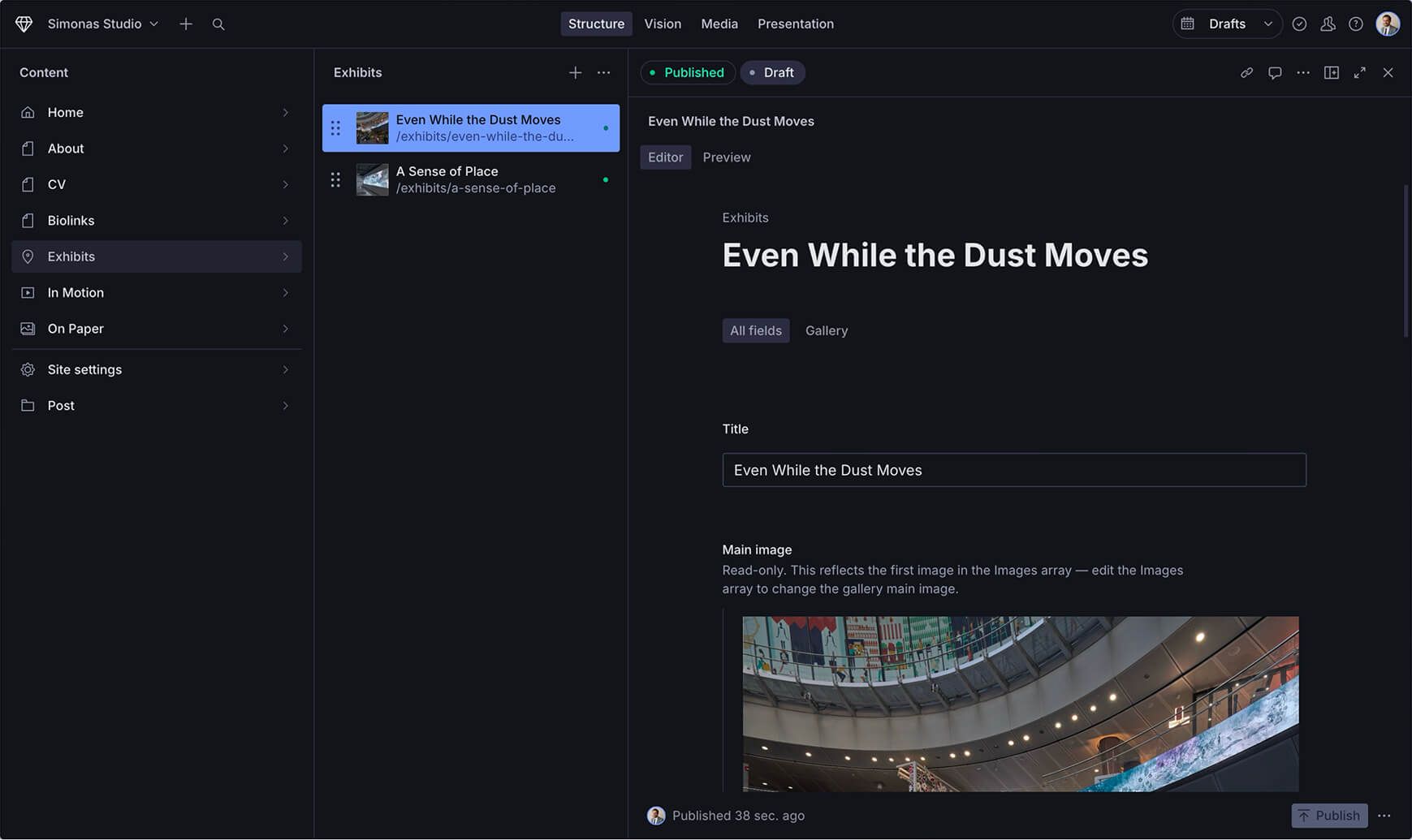
The biggest barrier to keeping the site current was the content management system. We migrated to Sanity.io, which treats content as structured data—like filling out a form rather than wrestling with layouts.
Now Simona can:
- Add a new exhibition by entering title, venue, location, and uploading images
- Link exhibitions to specific video works with a simple dropdown
- Update her CV with automatic cross-referencing to exhibit pages
- Reorder content by dragging and dropping
The site went from “I should update this” to “Oh, that only takes 30 seconds.”
Smart connections between content #
Art careers are interconnected—a piece shown at one exhibition might appear in another context, a video work might be part of multiple shows. We built a system where content references other content:
- CV exhibitions optionally link to exhibit pages when a curator wants to dig deeper
- Exhibit pages reference related video works from the In Motion gallery
- Smart back navigation means if someone arrives at a video from an exhibit page, the back button returns them to that specific exhibit (not just a generic gallery)
These connections mirror how curators and gallerists actually explore an artist's practice—following threads, making connections, building context.
The full-screen video homepage #
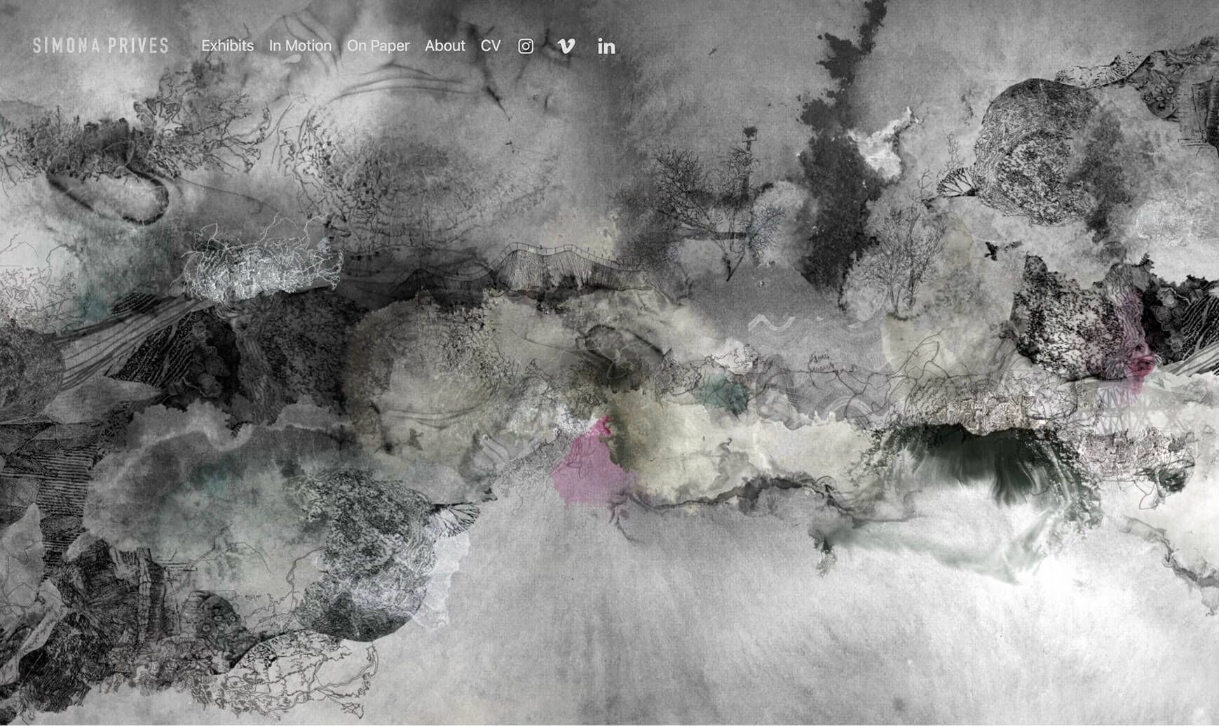
Sometimes you need one bold move. The homepage features Simona's work as a full-screen video background—immediately immersive, impossible to ignore. It sets a tone: this artist works with time-based media, thinks cinematically, and isn't afraid to be direct.
For audiences scrolling through dozens of artist portfolios, it's a moment of “oh, this is different.”
Progressive enhancement and web standards #
We built the site following web standards and progressive enhancement principles:
- Clean, semantic HTML that works even without JavaScript
- CSS that adapts to user preferences (dark mode, reduced motion)
- Modern web platform features (CSS layers, scroll snap, view transitions)
- Fast load times and responsive design
The technical approach aligned with our content philosophy: simple, native, and focused on what matters.
The result #
Simona now has a website that:
- Reflects her current work (because updating is easy)
- Makes the right impression in seconds
- Works as a professional home base for social promotion
- Gives curators, gallerists, and juries what they need quickly
- Feels prestigious and international
More importantly, she has a system that grows with her practice. As she adds exhibitions, residencies, and new bodies of work, the site adapts without requiring redesign or technical intervention.