Building the ResearchOps Toolbox
Working on a community-based project with lessons learned
Recently I was involved in a community-based project called The Research Operations Toolbox. It all started because, as a member of the ResearchOps Community, I was regularly meeting in random Donut Pairings with other members. For those who don’t know, Donut Pairings is a little app that runs inside our community Slack. You opt in by joining the #reops_pair_connect chat room and automatically get connected with another community member. Quite often I felt very lucky to be paired with the Cheese Board Members, but it turned out this is fairly common because they all do the pairings more than most. In these meetings and through really good conversations, my interest in User Experience Research (UXR) resulted in a new Slack channel called #training_and_courses. Then my interest in UXR tooling resulted in a full-blown project that included a website and a presentation at the ReOps Conference 2022.
It’s a lot to talk about – so for now I just want to share a small bit about how it was made and some things I learned about the practice of research.
Into the toolbox #
I was really lucky to work with two great collaborators on this project. Carolyn Morgan is a UX Researcher and the brains behind the survey design: she lent her expertise in 18+ interviews. I’m most thankful to Caro for driving these things home and bringing so much rigor and confidence to the project. Derek Nguyen is a Web Developer (and an impressive UX Designer too) who used our Airtable data and turned it into an interactive website. On this project I focused on project management and interaction design, but also learned a lot from my collaborators.
One area I was able to get some new experience in was research note taking and qualitative analysis. In the past I would have used plain text documents or an app like Optimal Workshop’s Reframer for note taking and analysis. But this time Caro suggested a more integrated approach. We took notes on a digital whiteboard called Miro. We even layered observations on top of screen shots of the block-level wireframes (see the 2nd screenshot below). I suppose this could have been done directly in Figma, where I designed the wires, but with the Miro board, we were able to tag/label the sticky notes to make the later analysis easier.
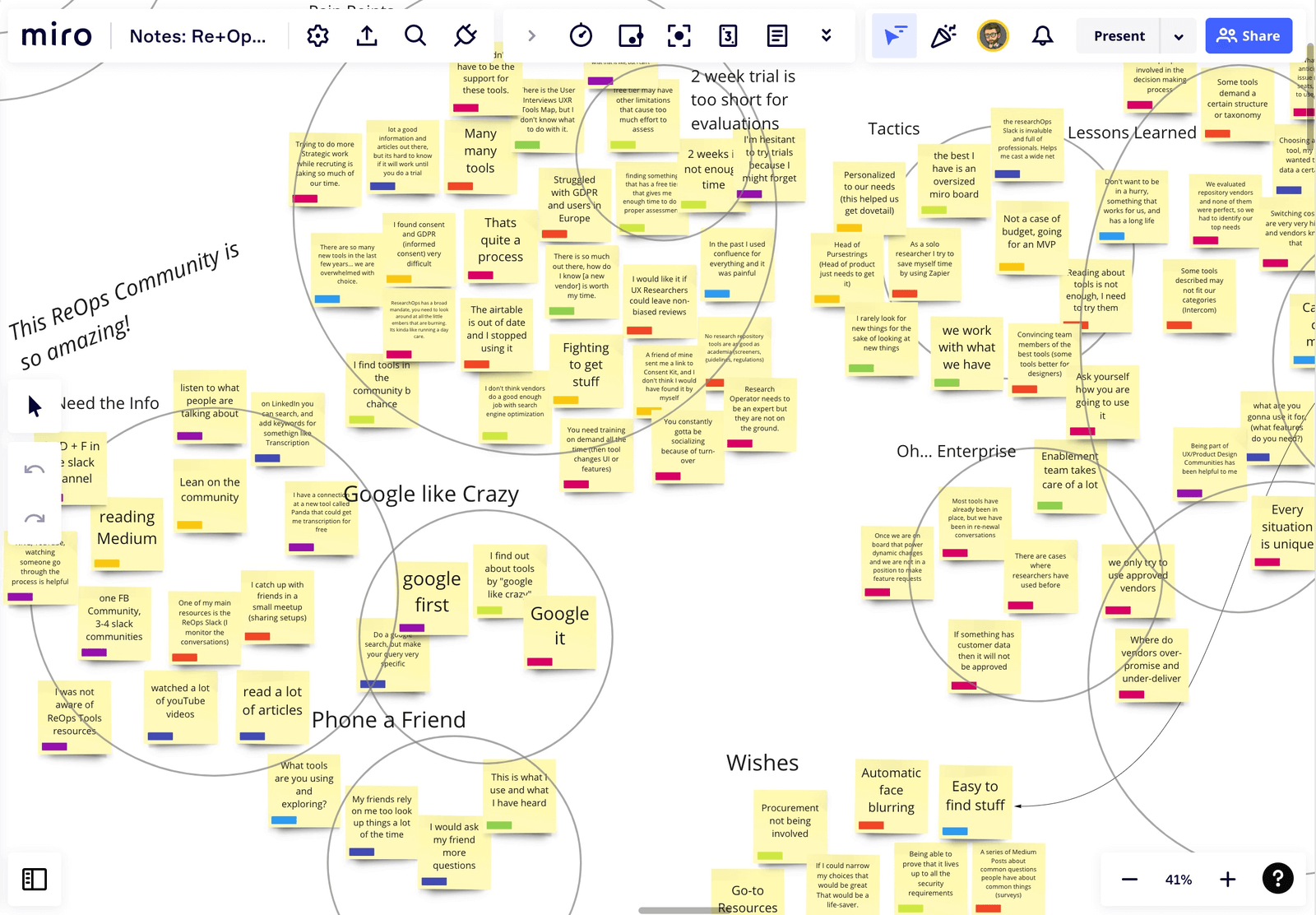
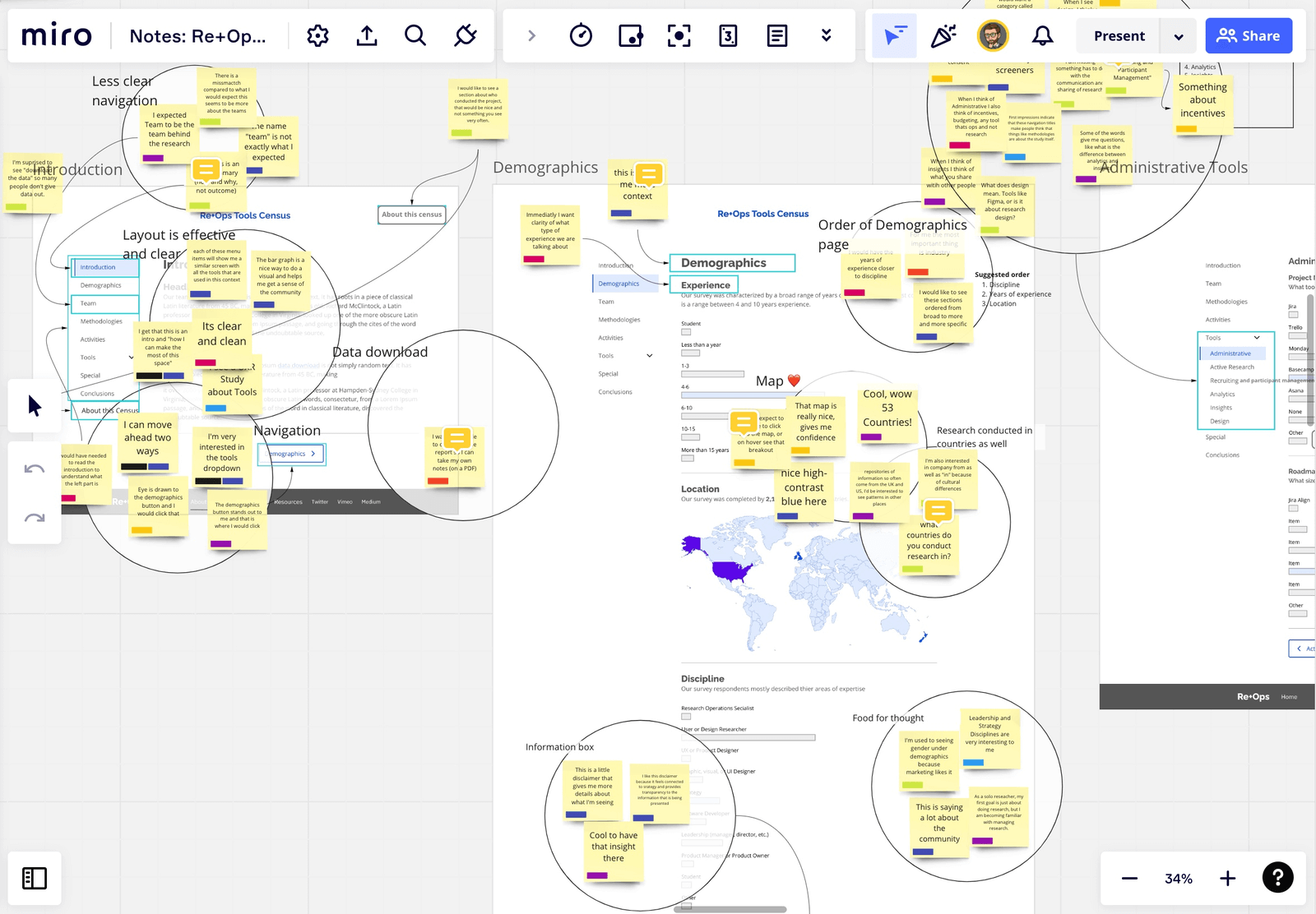
There is never any one right way to do this type of work. In this case, where we were mixing generative interview questions with the concept tests, it ended up being a great fit. You can see in the screenshots above how quickly the observations can be grouped and themed. The sticky notes on-top of the wireframes are both contextual to the designs and easy to group into common themes. Yes, I would work this way again.
Here are some things that went well #
- Testing early - We tested the wireframes very early in the design process. I knew that some things were not figured out and perhaps even wrong. But in this case the interview subjects were able to tell us what would work without being too influenced by an experience that felt finished.
- Starting simple - Absence of color and details kept participants from being distracted by aesthetics. Instead we learned about the real pain points and latent needs of our participants. One example was the categorization of tools. We found out that further analysis was needed and we ended up doing a card sort to improve our working taxonomies.
- Being open - Our participants gave us ideas that we had not even thought of – though now they seem obvious. For example, we have a visualization of survey results about what countries research teams are from. One of our participants said that they would also like to know what countries those teams conduct research in. This even lead us to create a fancy alluvial diagram to display that data.
- Cut hard - Concept testing helped us make the tough decisions about what to include in the project. There were many good ideas out there, but we had to balance that with the length of the survey. The first version of the survey took over 40 min to complete. The final survey typical completion time was less than 14 min.
- Protect your participants - Those really good note taking techniques I mentioned earlier allowed us to delete the recordings within one week. Those recordings were a lifesaver to make sure we got all the details right, but we did not need to keep them on file any longer than that. Like Kasey Canlas would say: just delete it!
- Secret sauce - The layered notes and insights made the next steps of the design process so much easier. It’s like the answers to the test were right there in the research. As a designer I didn’t have to question myself about which navigation patterns would work. The team and I had confidence that it would work and be enjoyable.
The rewards of volunteering #
The most important thing I learned is how rewarding it can be to be involved in a community-based project. In the case of the ResearchOps community it can be as simple as starting a new channel or taking on a big ambitious project. We can share our amazing skills or learn new ones by participating. If this sounds interesting to you, here is the new Re+Ops Volunteer sign up form.
This post is also published on the ReOps Community Blog.
Read more posts
- Previous:
 Culture Secrets
 - Next:
 UX and the TIGR Patrol Debrief Program